Component Factory Plugins & Drupal Paragraphs
Demystifying the component factory and how it’s used to render paragraph content from Drupal
An introduction to Gesso’s Component Factory used to render Drupal Paragraphs in a decoupled Next.js frontend application. Before I get started, there is a whitepaper that explains a lot of what this article will cover, however, this article is more of a practical use guide when working with the Gesso starter kit and Drupal.
This article will cover 4 common scenarios:
- What you get with Gesso's default installation
- Customizing Gesso defaults through Drupal configuration
- Extending a Gesso component with new options and fields
- Custom paragraphs, plugins and frontend components
Gesso’s default installation
After installing Drupal and a Next.js frontend following the Gesso installation guide, you can make a dynamic page in Drupal using the various Paragraphs provided, which, in turn, are then rendered in the frontend via the ComponentFactory.tsx component that is automatically added to the frontend project.
This file initializes the default component plugins that work with the Drupal side of things. With it, all you need to do is pass the paragraph field data into the component wherever you need those paragraphs rendered.
<ComponentFactory data={payload.data.fieldComponents} />
The component factory loops through all of the paragraph data, matches the paragraph type to a plugin, and the plugin passes the data into a frontend component.
Here’s an example. Note that the example images are from a project that uses Gesso.
| Backend edit page | Frontend rendered page |
|---|---|
A Drupal edit page showing a Basic Content (WYSIWYG) paragraph inside of a Section paragraph. 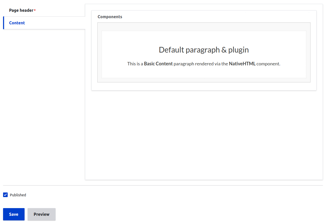 | A Drupal edit page showing a Basic Content (WYSIWYG) paragraph inside of a Section paragraph. 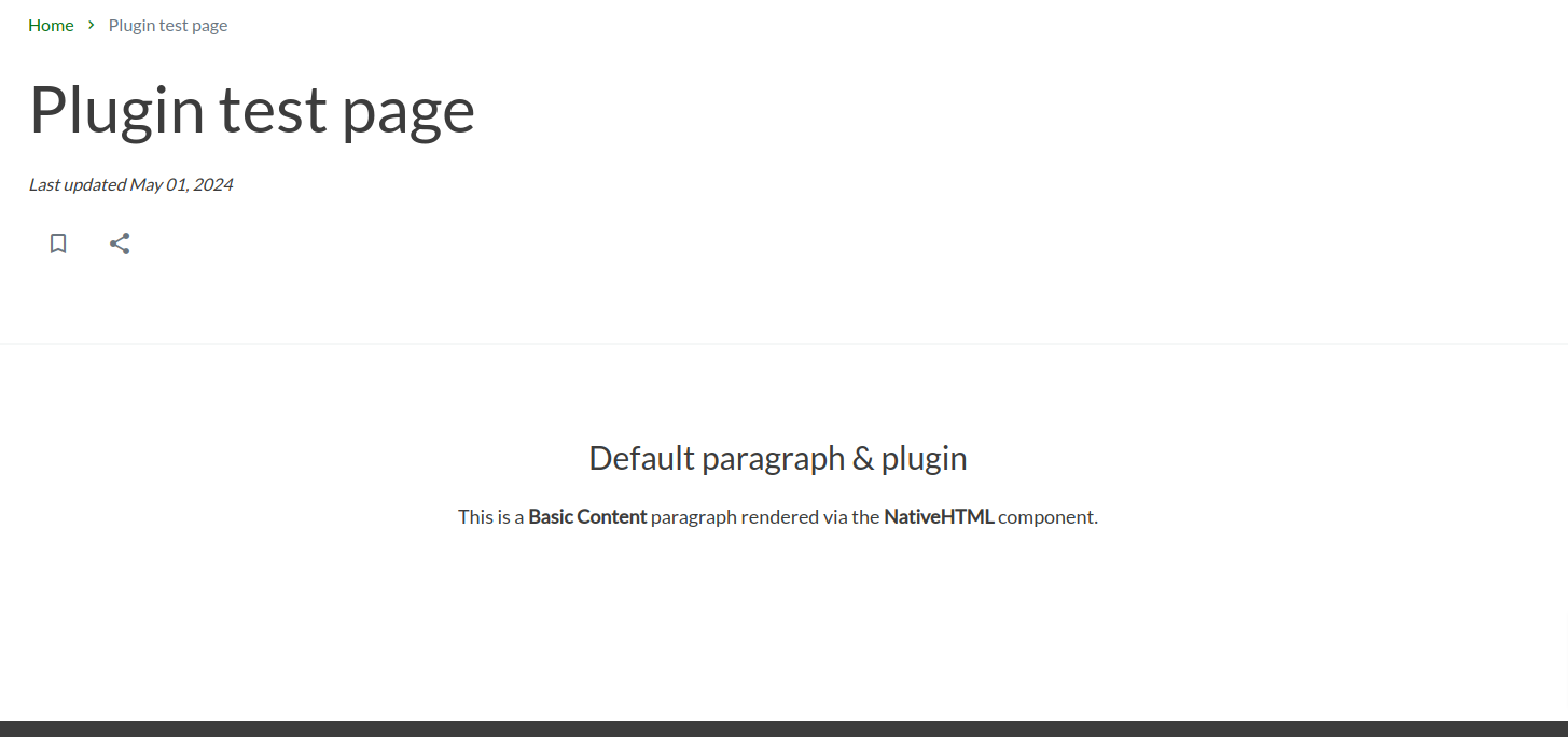 |
Customizing Gesso defaults through Drupal configuration
Depending on the project, you may need to customize the defaults of a paragraph to match what your project needs. This simple customization can be done directly in Drupal by editing the fields and exporting the updated configuration.
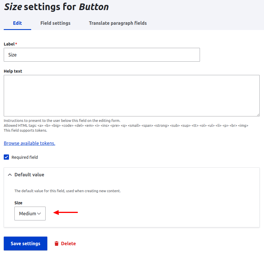
For example, the Button paragraph has a size field that could be adjusted if your project requires that the “small” button size should be the default. The default coming from Gesso has this field defaulting to “medium”.
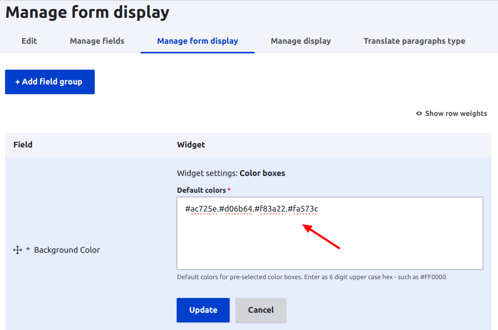
The Section paragraph has background colors that content creators can optionally select. The available colors should match the background colors of your design system tokens in Figma. You may need to adjust the colors.
To make this type of adjustment:
Login to the Drupal backend.
Go to the Paragraph Types page (
/admin/structure/paragraphs_type).Click “manage fields” for the paragraph type that needs to be updated.
Click “edit” for the field that needs to be updated.
tipIf you don’t see what you need when editing the field, check the paragraph types “manage form display” tab instead. Sometimes settings are available there instead. This is true for colors.
Make the adjustments that you need to make and save the field.
Finally, export and commit the configuration change.
| Button size field default | Color field options in the manage form display tab |
|---|---|
 |  |
Extending a Gesso component with new options and fields
Sometimes you may need to add additional fields or options that don’t mesh with what Gesso has by default. This is where things start to get a bit more complicated, but not too bad. Now we have to add new configurations to the Drupal backend and use Gesso’s plugin system to override one of the existing plugins.
I’ll build on the Basic Content paragraph example from earlier.
Backend changes, adding fields
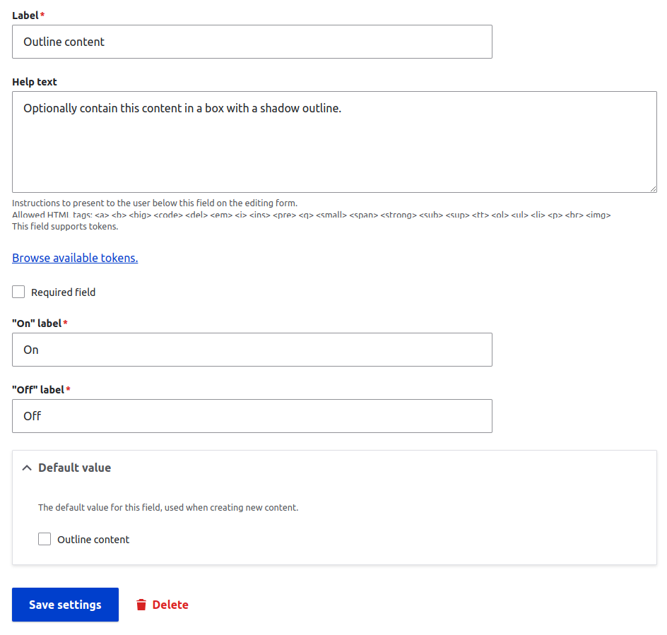
First, in Drupal, we’ll make our configuration changes to the paragraph. In this case, we’ll configure a new field. Here’s a simple boolean field that I’ll use to wrap the frontend component in a containing box.
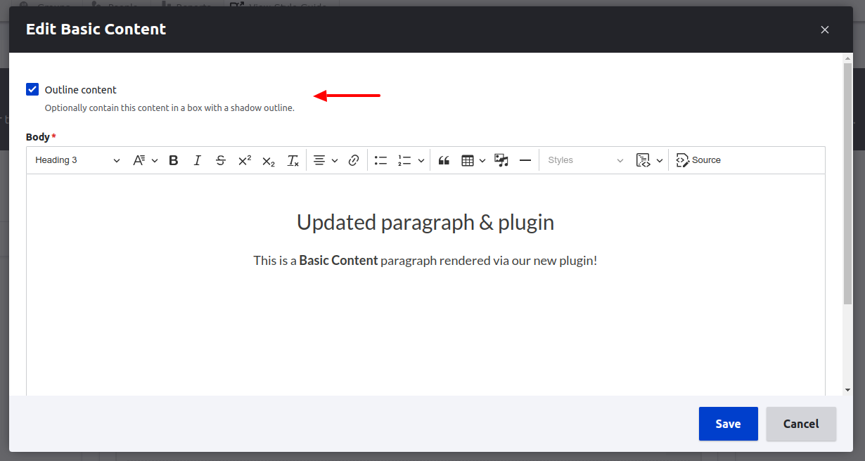
Next, on my test page, I’ll edit the existing paragraph and apply the new boolean setting.
| Editing the paragraph on my test page | My updated page the backend |
|---|---|
 |  |
Before moving on the the frontend, the next important step is to expose that new field to our API. You can do this by:
- Go to your GraqhQL server (
/admin/config/graphql) and edit it. - In the "enable fields" accordion, find the new field and check it.
- Save the changes.
- Export and commit the configuration changes.

Frontend changes, creating a plugin
When I view the updated page in the frontend, nothing has changed. Our next step is to add a plugin.
Since this is the first plugin in the project, I’ll create a new src/plugins directory. Inside, I’ll create a new BasicContentPlugin.tsx file. You can set up the directories and files however you like. This file will be used to replace the default Basic Content plugin, so the easiest way to start is to copy the code over directly from the Gesso repo. Don’t forget to change imports to your own design system.
The plugin file currently looks like this. Note that there are a few additional files added, a cardinality utility and Drupal-specific types. Those are copied over from Gesso, too.
import { ComponentFactoryData, ComponentFactoryPlugin, NativeHTML } from '@example/design-system';
import { cardinality } from './pluginUtils';
import { DrupalString } from './pluginTypes';

type BasicContentData = ComponentFactoryData & {
  field_body: { value: DrupalString[] | DrupalString };
};

const BasicContentPlugin: ComponentFactoryPlugin = (data) => {
  const { field_body } = data as BasicContentData;
  const code = cardinality(cardinality(field_body.value)?.value);

  if (!code) return null;

  return <NativeHTML code={code} />;
};

export default BasicContentPlugin;
Before adding in our new field to the plugin, make sure that the plugin is working as expected. Open up that ComponentFactory.tsx file in src/components and add in the new replacement plugin.
Before:
import { initComponentFactory } from '@acromedia/gesso';
import { componentFactoryPlugins } from '@acromedia/gesso-drupal';

const ComponentFactory = initComponentFactory(componentFactoryPlugins);

export default ComponentFactory;
After:
import { initComponentFactory } from '@acromedia/gesso';
import { componentFactoryPlugins } from '@acromedia/gesso-drupal';
import BasicContentPlugin from '~/plugins/BasicContentPlugin';

const plugins = {
  ...componentFactoryPlugins,
  basic_content: BasicContentPlugin,
};

const ComponentFactory = initComponentFactory(plugins);

export default ComponentFactory;
The initializing function takes all of the default plugins first and passes in our custom ones after. This allows us to replace default plugins and add new ones. Note that the key for our new plugin is the paragraph’s “type” machine name.
If you visit your frontend test page, you should still see the content rendering as you would expect.
Frontend changes, customizing the plugin
Now we can add in the new functionality! We’ve already configured the field so logging the data prop to the console will confirm that the field data is available. From there, we can update our plugin however we need.
import { ComponentFactoryData, ComponentFactoryPlugin, NativeHTML, Box } from '@example/design-system';
import { cardinality, getDrupalBooleanValue } from './pluginUtils';
import { DrupalString, DrupalBoolean } from './pluginTypes';

type BasicContentData = ComponentFactoryData & {
  field_body: { value: DrupalString[] | DrupalString };
  field_outline_content: DrupalBoolean;
};

const BasicContentPlugin: ComponentFactoryPlugin = (data) => {
  const { field_body, field_outline_content } = data as BasicContentData;
  const code = cardinality(cardinality(field_body.value)?.value);
  const isOutlinedContent = getDrupalBooleanValue(field_outline_content);

  if (!code) return null;

  if (isOutlinedContent) {
    return (
      <Box padding="lg" borderRadius="large" shadow>
        <NativeHTML code={code} />
      </Box>
    );
  }

  return <NativeHTML code={code} />;
};

export default BasicContentPlugin;
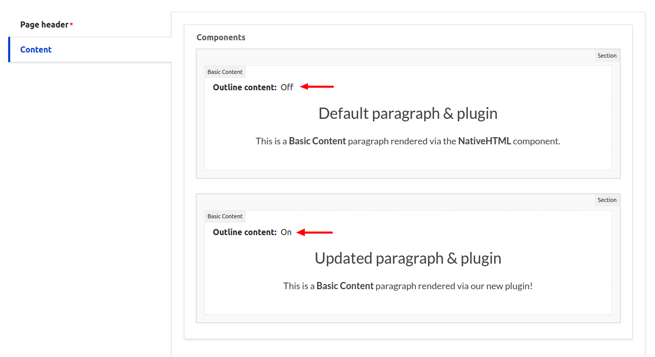
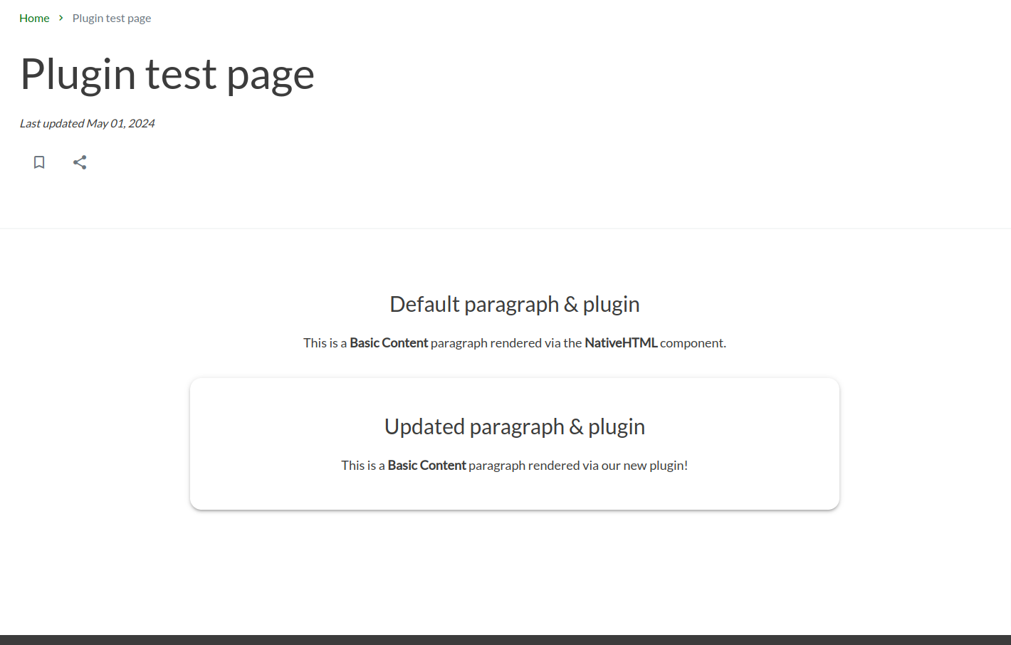
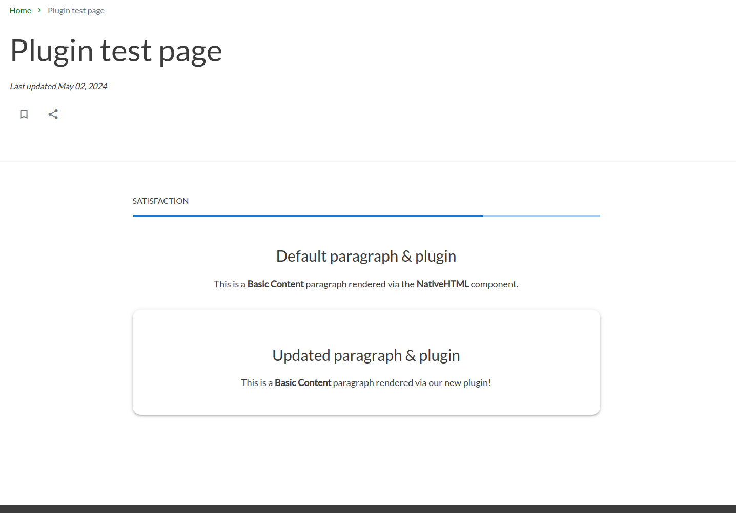
And here is the rendered frontend! Here we have two basic content paragraphs — the original and another with our boolean checked.
Custom paragraphs, plugins and frontend components
If your project needs an entirely new, custom component made with a matching Drupal paragraph, the process is very similar. Here’s a quick example of this in action.
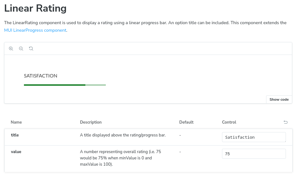
This project has a simple “Linear Rating” component that puts a title above a rating value. Here it is in Storybook.
Adding the new paragraph to Drupal
First, let’s configure the new Linear Rating paragraph in Drupal.
- Go to the Paragraph Types page (
/admin/structure/paragraphs_type) - Click the add paragraph type button
- Configure the paragraph, its fields, and its display settings. Always make sure that fields have clear descriptions and are in an organized and logical order. Think about the end users.
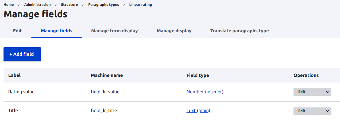
- Expose the new fields to the API
- Add the paragraph to a backend test page.
- Export and commit the configuration.
If your paragraph has many options, make sure to test each option and edge case! The last thing you want is to release your new feature and have it cause an application error because you didn’t properly test it. Don’t rely on QA to catch everything.
| Editing the paragraph on my test page | My updated page the backend |
|---|---|
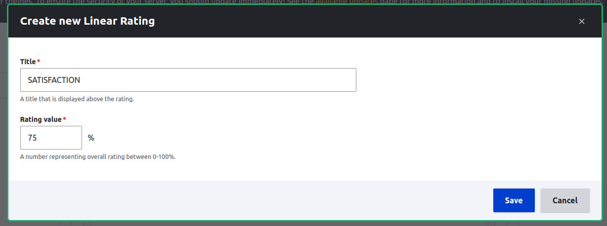 | 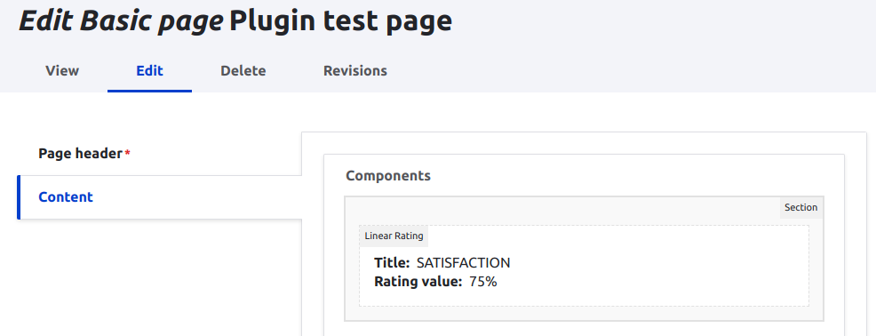 |
Creating the frontend plugin
Here we will essentially follow the same steps as before.
- Create our plugin file.
- Add the plugin into the Component Factory initialization function
- View it on the frontend to confirm that it works
Here’s the simple plugin file - LinearRatingPlugin.tsx
import { ComponentFactoryData, ComponentFactoryPlugin, LinearRating } from '@phsa/design-system';
import { cardinality } from './pluginUtils';
import { DrupalString, DrupalNumber } from './pluginTypes';

type LinearRatingProps = ComponentFactoryData & {
  field_lr_title: DrupalString;
  field_lr_value: DrupalNumber;
};

const LinearRatingPlugin: ComponentFactoryPlugin = (data) => {
  const { field_lr_title, field_lr_value } = data as LinearRatingProps;
  const title = cardinality(field_lr_title.value);
  const value = cardinality(field_lr_value.value);

  return <LinearRating title={title} value={Number(value)} />;
};

export default LinearRatingPlugin;
Then, the updated Component Factory component.
import { initComponentFactory } from '@acromedia/gesso';
import { componentFactoryPlugins } from '@acromedia/gesso-drupal';
import BasicContentPlugin from '~/plugins/BasicContentPlugin';
import LinearRatingPlugin from '~/plugins/LinearRatingPlugin';

const plugins = {
  ...componentFactoryPlugins,
  basic_content: BasicContentPlugin,
  linear_rating: LinearRatingPlugin,
};

const ComponentFactory = initComponentFactory(plugins);

export default ComponentFactory;
And finally, the rendered frontend page that includes the new “Linear Rating” paragraph followed by the other two test paragraphs from earlier.
In Closing
And there you have it. These are the ways in which you can configure Paragraphs in Drupal and have those changes reflected in your frontend via the Component Factory. Paragraphs and Component Factory plugins are a powerful way to give content creators many options for creating customizable pages.
To recap, the most basic change is to adjust default paragraph settings directly in Drupal itself. Next, you can add new fields for paragraphs in Drupal and pass those fields to the frontend via plugins and the Component Factory. Finally, you can extend the Component Factory with custom plugins for entirely new Drupal paragraphs.